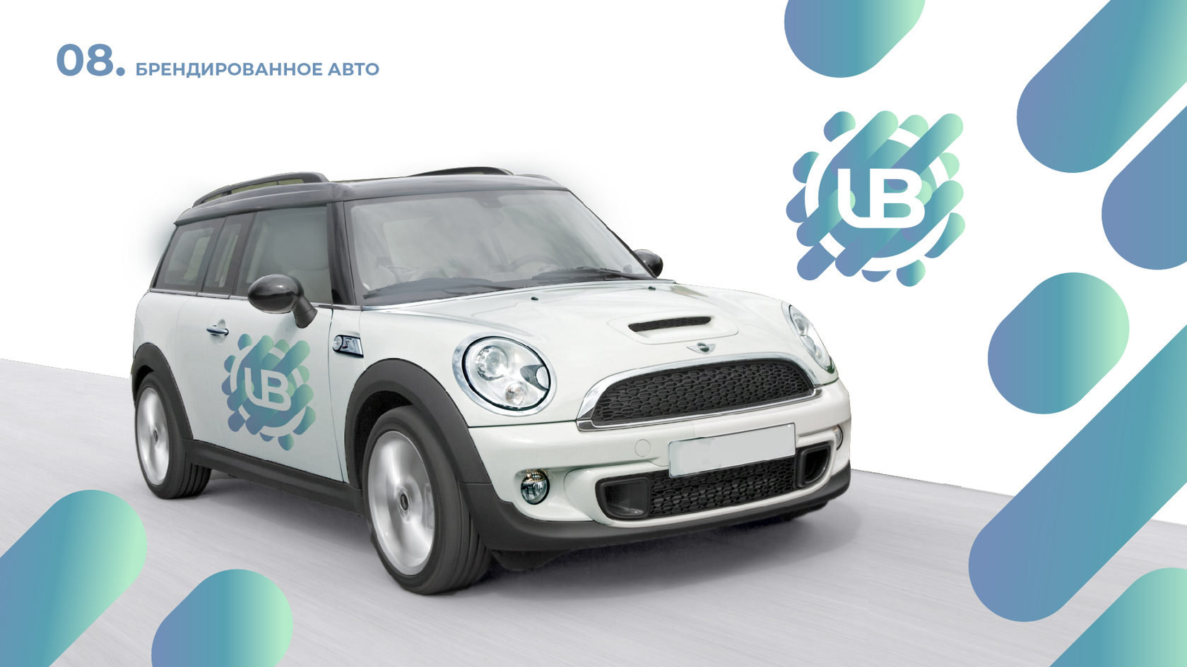
Our company was approached by a client - executive coach and business coach Babyak Uliana. Uliana has a great experience in leadership, as well as many skills in other business niches, which are so important nowadays for executives. Personal coaching, accompanying aspiring executives, as well as conducting trainings in the corporate format - all of this Uliana Babyak brings to the business, thereby sparking a new development of the company.
Task:
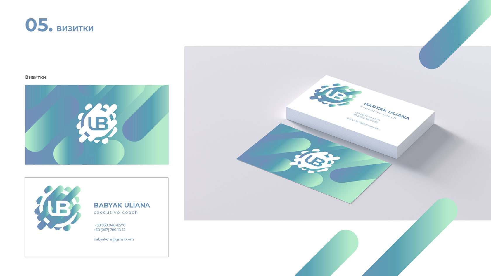
We were tasked with designing a logo to be used for branding presentations, website, printed printing and business cards. The client's wishes were that the logo should play off her last name and first name. The personal logo should look bright but memorable and evoke associations. The logo also needed to show the semantic implication - to demonstrate the exclusivity of the services provided.
The solution:
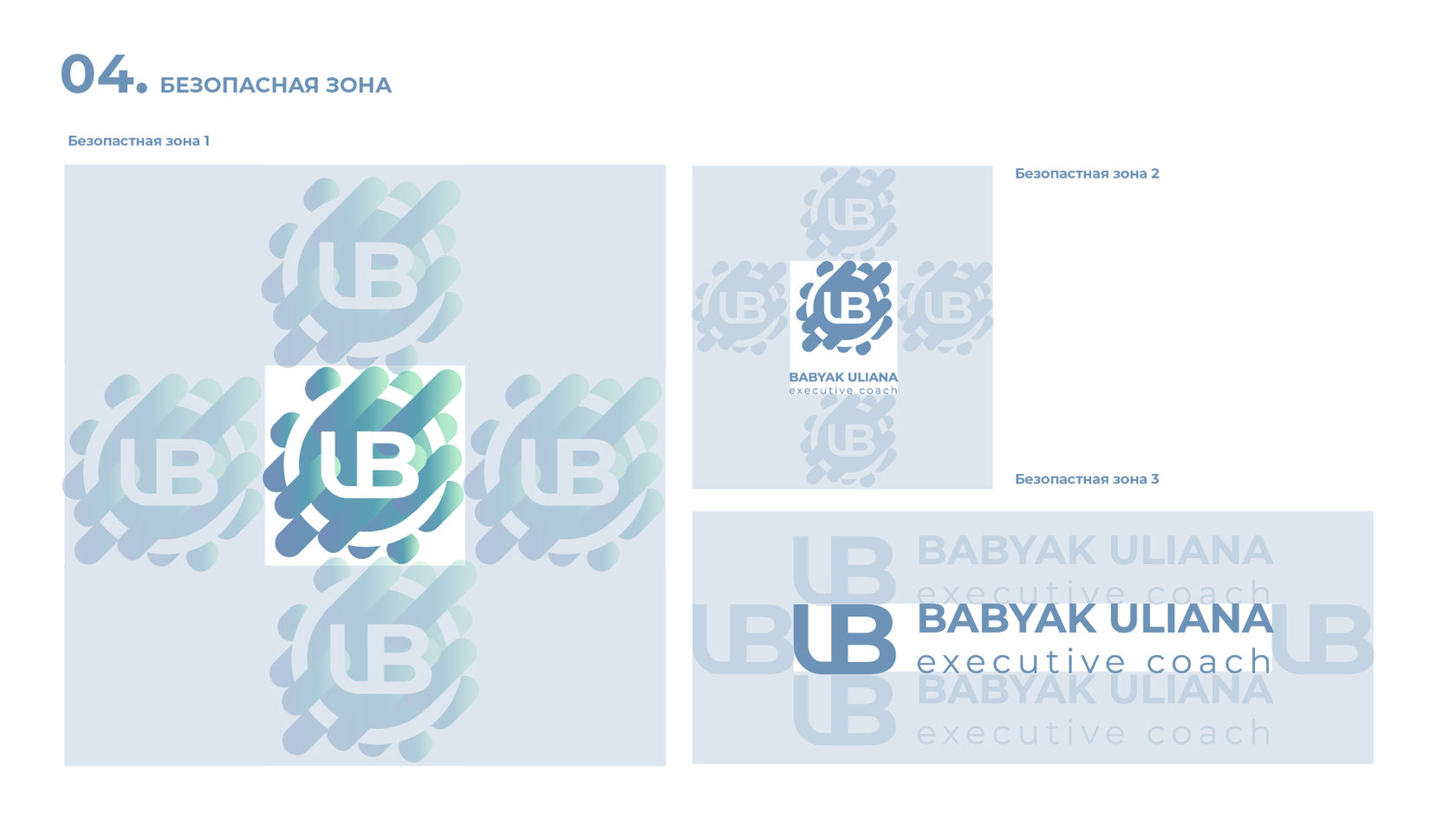
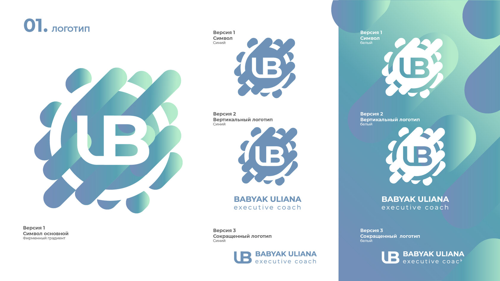
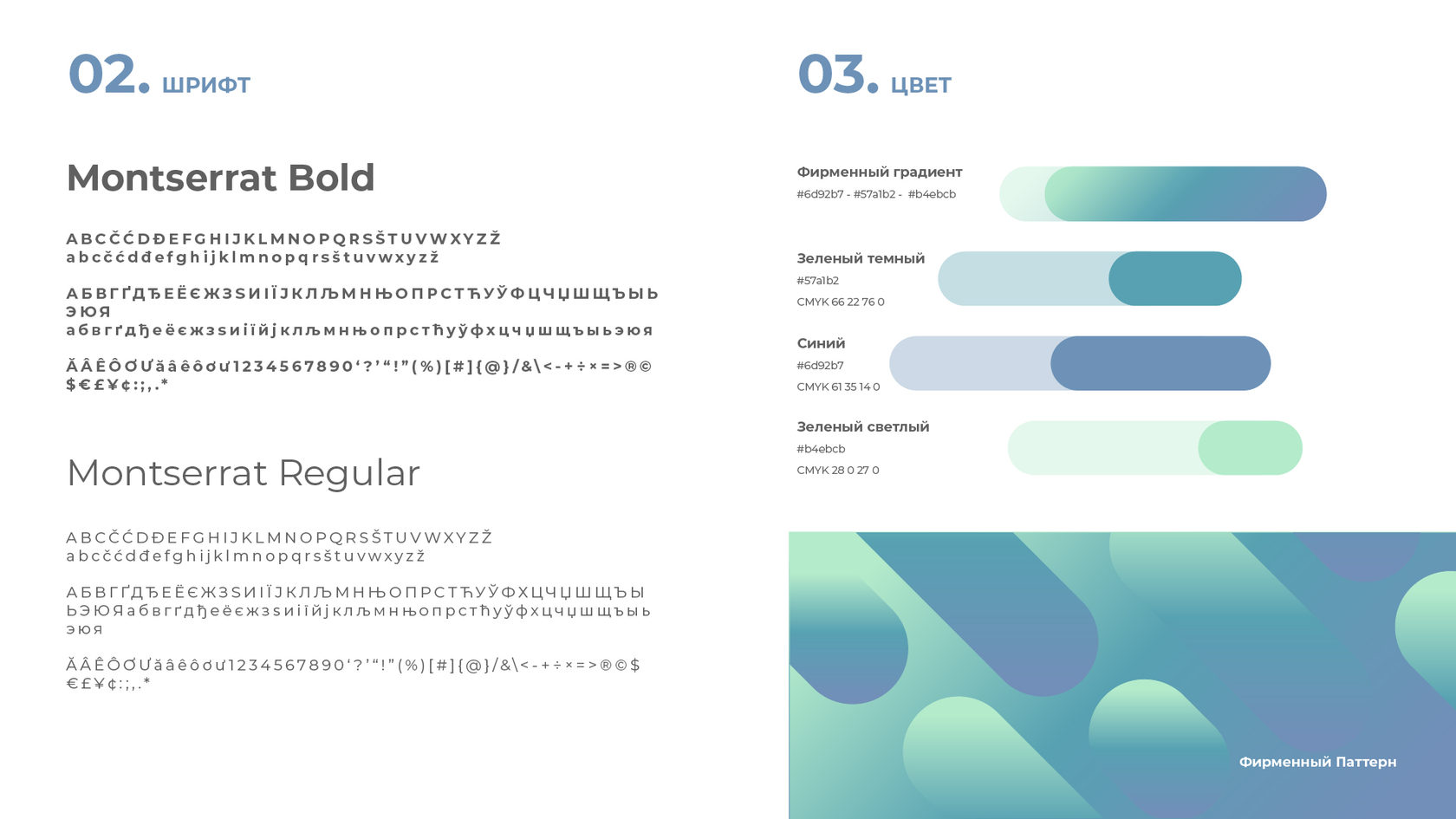
Since coaching and exclusivity are abstract words, the logo was also designed with an abstract element. The designer came to combine the acronym "BU" in the logo. In the color palette, the client wished to use light green and blue tones. To recreate the desired look, the designer combined the shades in a gradient and made additional basic logo options in a monochrome form. Also, to complete the logo image, a circle was added to symbolize the center - coach Ulyana Babiak. And rounded rectangular elements crossing the circle - the customers. Combining all these elements, got the meaning load - a mutually beneficial cooperation, the provision of services business coach. Coaching logo is made in a graphic style, memorable, consists of elements that can be seen.
What we did:
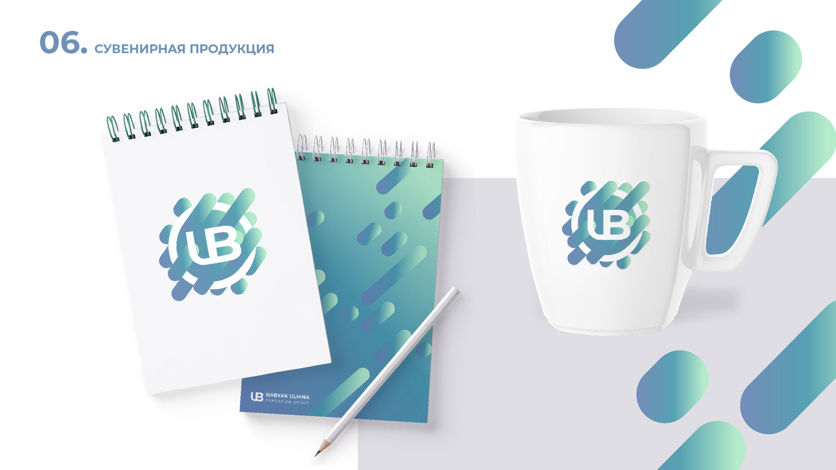
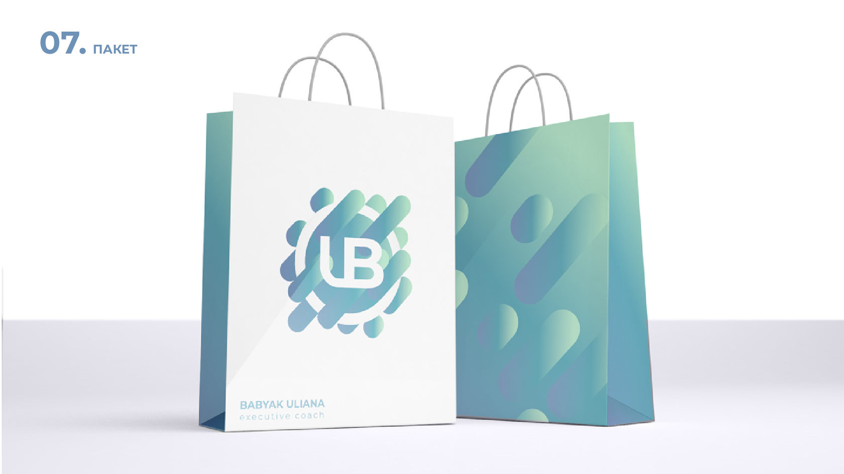
Developed a unique logo design for a business coach that contains semantic overtones. Displayed the logo on the brand identity - you can appreciate how spectacular and exclusive it looks on the print media.
