Our company was approached by a client - a network of dental clinics Feya. This is one of the large networks of dental clinics, which operates in the Russian Federation. The main objective of the network is impeccable quality of services provided. Feya clinics, focus on the form of "one patient" - it presents high-quality procedures, as well as maintaining a friendly environment and personal approach to each client individually
The Challenge:
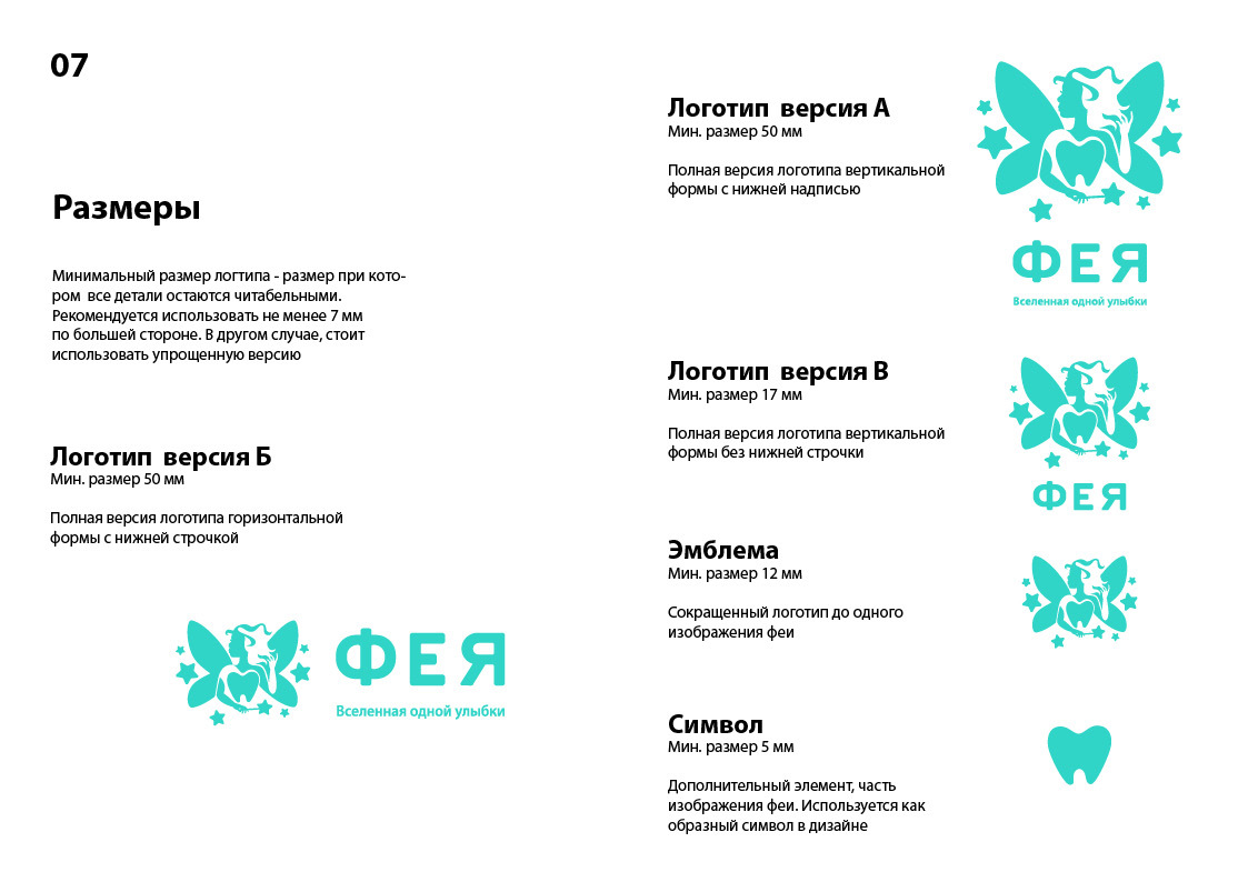
We were tasked with designing a logo for a dental clinic that would reflect the name and scope of the company. This logo for dentists, should also have a message of a friendly atmosphere and philosophy of the company. The client's wishes were based on the fact that the logo displayed elements specific to the dental niche, as well as elements that reflect the name of the clinic network.
Solution:
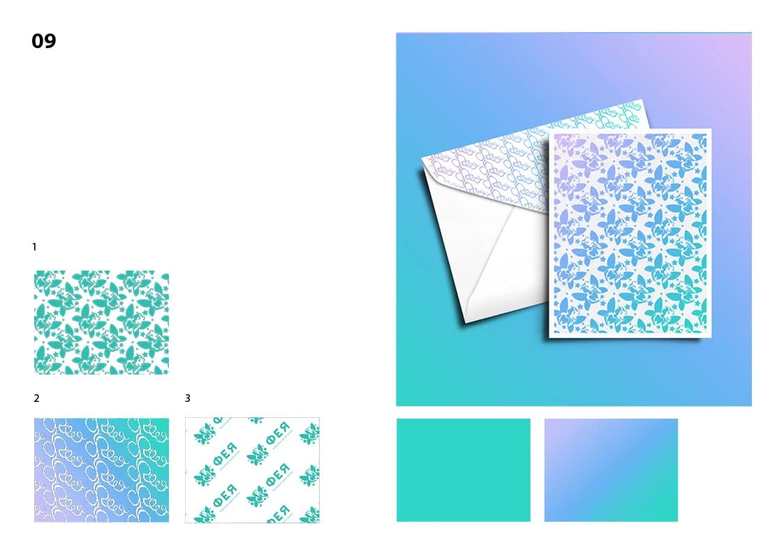
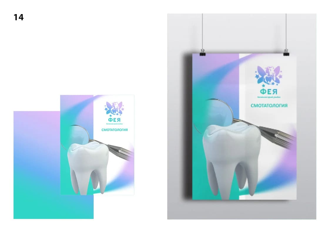
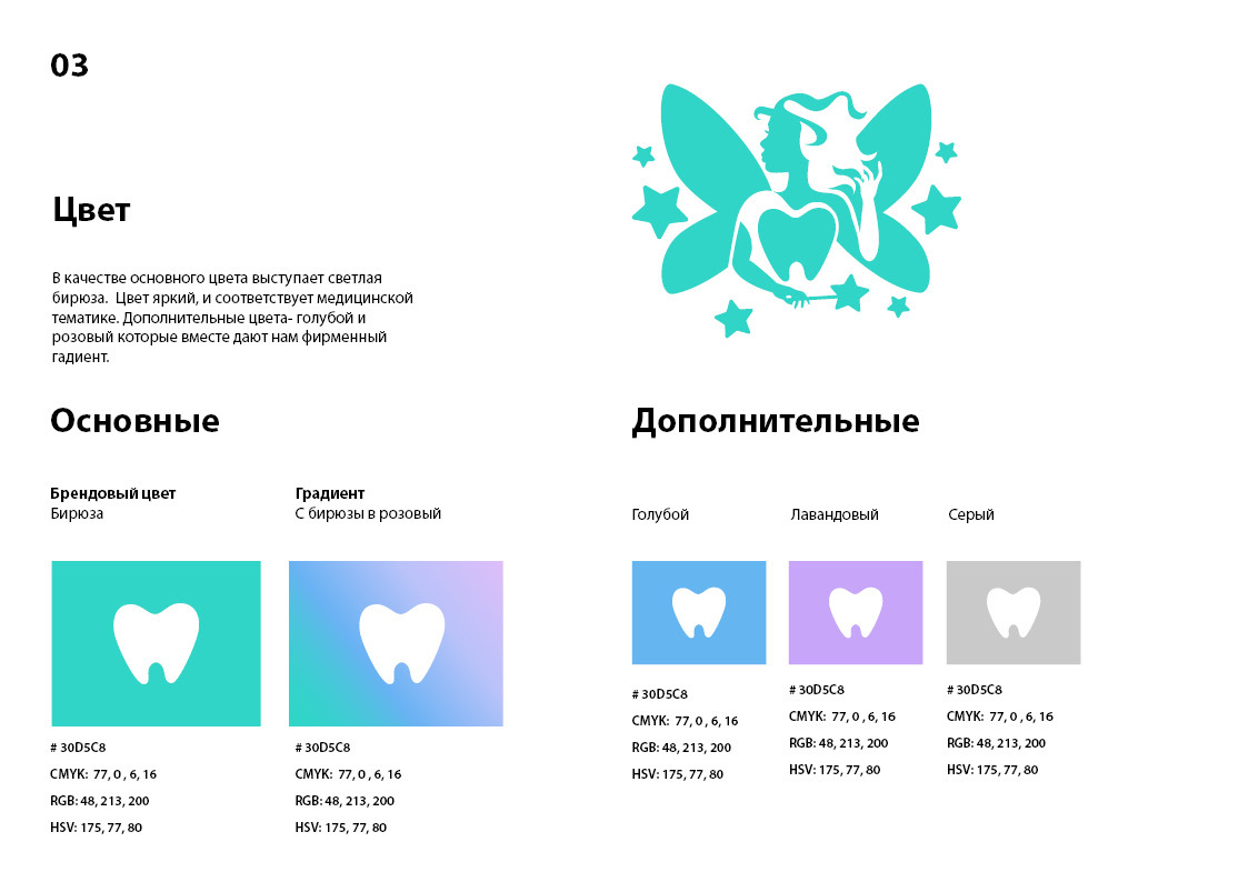
Our designers presented an idea, which united all the wishes of the client. Creative solution of this situation was the use of two main elements - the silhouette of a fairy and a tooth. To make the logo look interesting and atypical, the tooth was used in the form of a fairy corset. The full silhouette was beaten in negative style, which allowed getting an elegant minimalistic image. For the color solution the client had his own wishes - to use green and purple, our designers used a light shade of turquoise green, which flowed into a gradient with light pink - imitating a cosmic nebula.
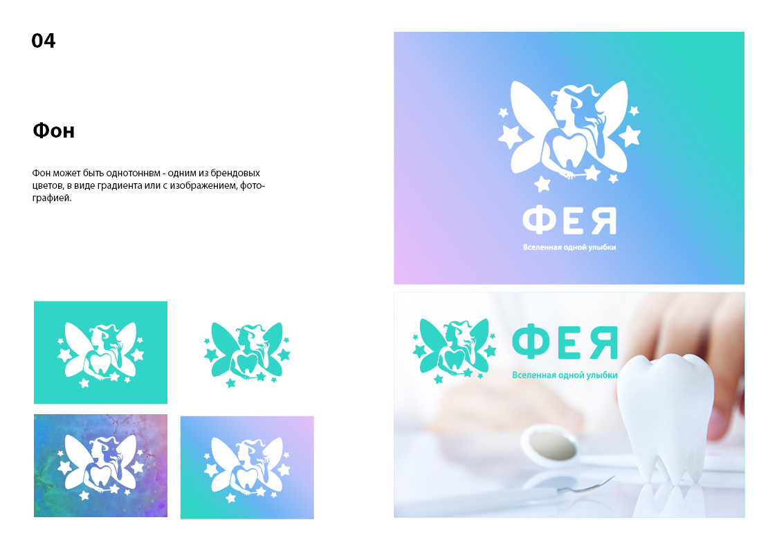
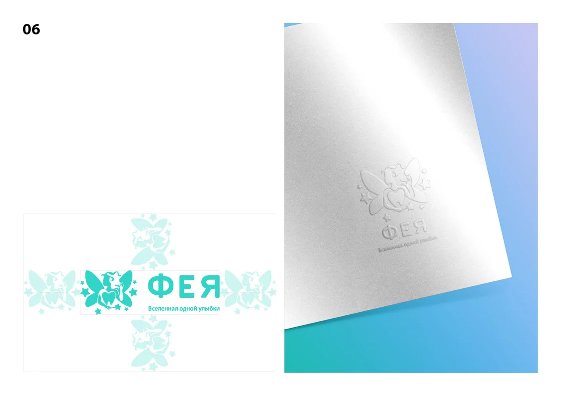
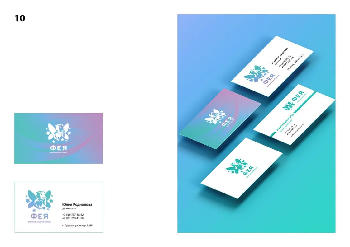
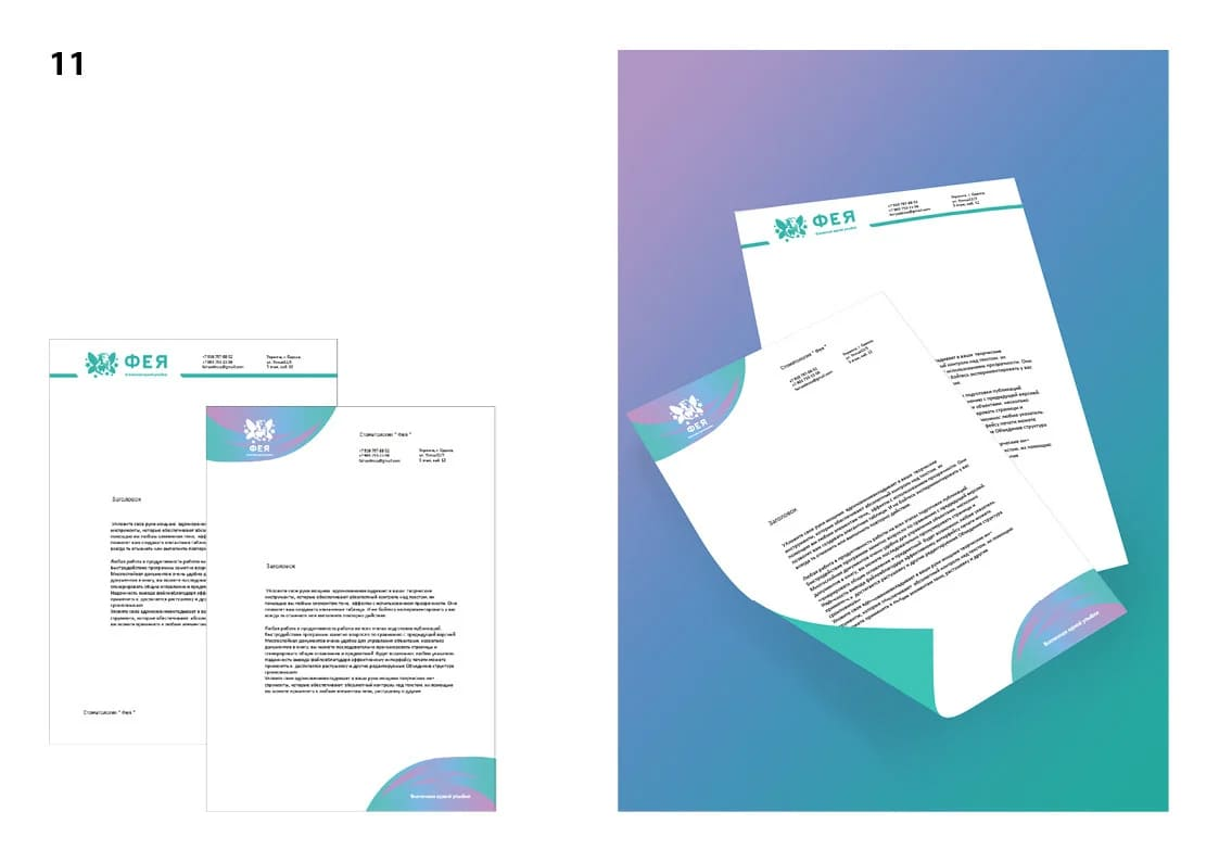
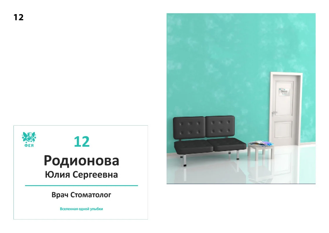
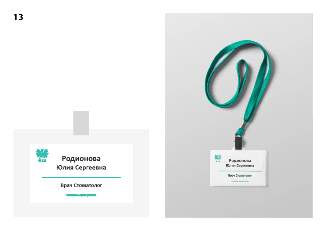
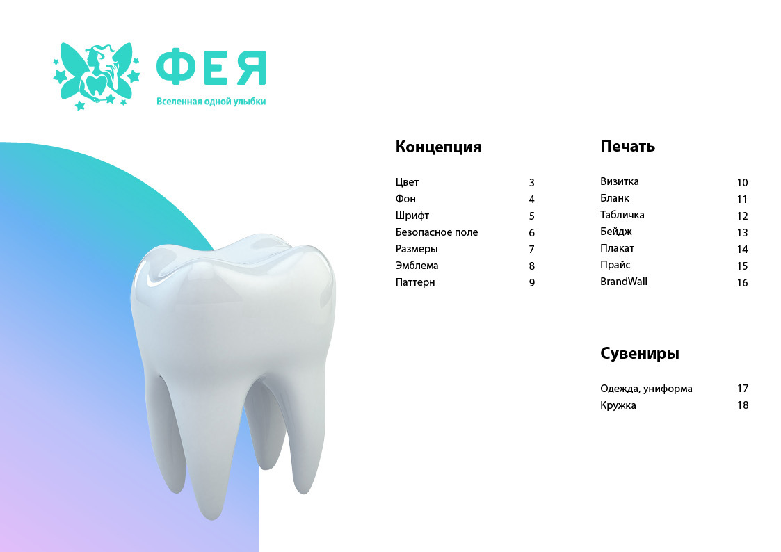
Developed a unique logo for the dental clinic that has a double undertone. We also mapped the logo onto the corporate identity - you can appreciate how spectacular it looks on print media and in interior design.