In the spring of 2020 our company started cooperating with a Ukrainian tour operator "Zima-Summer". The client started in the travel industry more than 10 years ago, but for the past 4 years the business has been on pause.
In summer 2020 the company planned to come back to the Ukrainian market, but the full restart was prevented by the quarantine introduced during the pandemic of COVID-19 virus.
But despite the circumstances, our client decided to work. Having analyzed the situation, the tour operator's team came to the conclusion that because of the closure of borders in the summer of 2020 Ukrainians will mainly rest in the resorts of their country. The company decided to buy out rooms in several hotels in the south of Ukraine and sell one-week tours.
The plan was to develop several lines of work: one - cooperation with travel agencies and the second - the sale of tours to end customers.
The challenge:
After reloading the company "Winter-Summer", of course, needed a rebranding. However, as such corporate identity the tour operator had no logo and in fact we developed the branding for the client from scratch.
Also we have developed several Landing Pages for the tour operator, in accordance with the new programs of tours that the company offers to customers.
Solution:
We suggested several logo options:
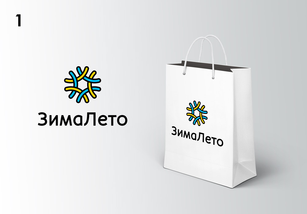
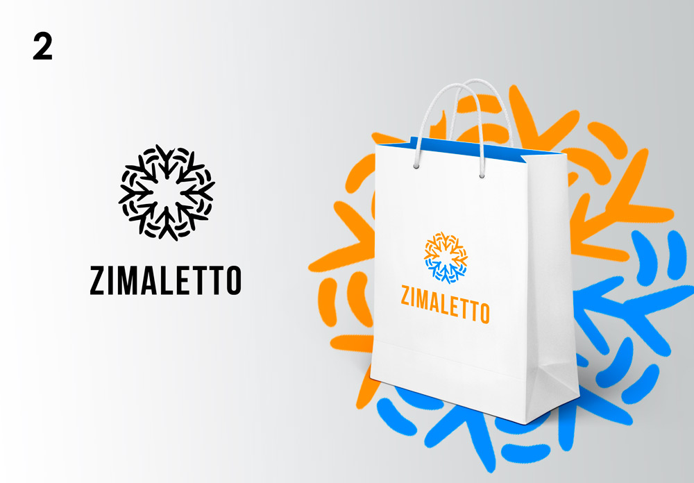
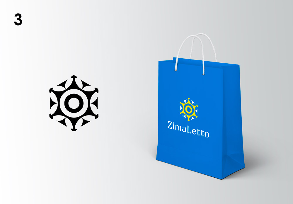
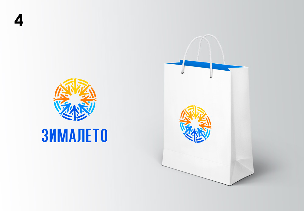
And in the end, the company representatives opted for this logo:
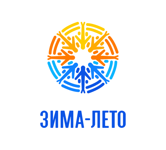
In this variant our designer reflected both the name of the company (orange color symbolizes summer, blue - winter), and its field of activity - to the center of the logo are directed planes, forming a snowflake.
After the design of the logo together with the customer we selected the corporate color, font, finalized other elements of the company's branding
The main site of the company is a large portal, which is outdated, and the creation of a new resource could take a long time. Therefore we decided to separately create a Landing Page for each tour on the Tilda website builder and run ads on them.
Since we already had a corporate identity and logo, we began the development of the portal with the creation of the board
Here is, for example, the structure of Landing Page, which we defined for the page presenting the tour in the Iron Port.
- General headline with the company's offer.
- Description of the location: we start from the problem of the season 2020 and finish with information about beach vacations in the direction of Iron Port.
- Description and UTP of the hotel where tourists will vacation.
- Suggestions for holiday packages.
- Additional OTP tour: tell what the tourist will have during the rest with our company.
- Video overview of the beach, hotel and entertainment in Iron Port. The block helps to study the infrastructure of the location without leaving the site.
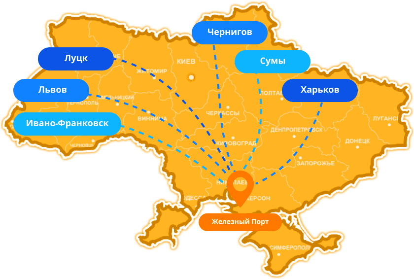
- Routes: information from which cities and which routes the company's buses move.
- Dates: actual dates for tours.
- Sightseeing: additional ATP that encourages potential client to make a positive decision.
- Entertainment in Iron Port: description of locations for recreation at the resort.
- Offers: a description of additional offers company "Winter-Summer".
- How to book a tour: step by step instructions for booking tours.
- Our routes: description of cities from which our tours depart.
- Information about the tour operator: certificates and company description.
- Contacts.
After that the editor got to work and we have written texts for each landing page, for each version of tours summer 2020.
Conclusions
Despite the pandemic and the quarantine our client took the risk to restart his company. The right decision was to completely rebrand the company and create new attractive pages with the tour operator's offerings for Summer 2020.
After all landing pages were created, we launched an advertising campaign to attract an audience for our client. Landing Page showed excellent conversion results, which you can read more about in our case study on the promotion of the company "Winter-Summer".
