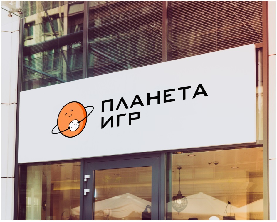
Our company was approached by a client, the owner of a board game club called Planet of Games. The company has been on the market for a long time and needed to rebrand the logo. The old logo was very outdated, this industry requires a new and fresh look at this element. The board game industry is rapidly evolving and still competes with the latest computer games because of its ability to bring people together in teams and have unforgettable evenings.
Objective:
We were tasked with designing a logo that reflected the direction of the club and combined the name. The client's wishes were that the logo should not be childish and catchy. Such a logo should carry the main message of the club and board games in general - friendly company spirit.
The solution:
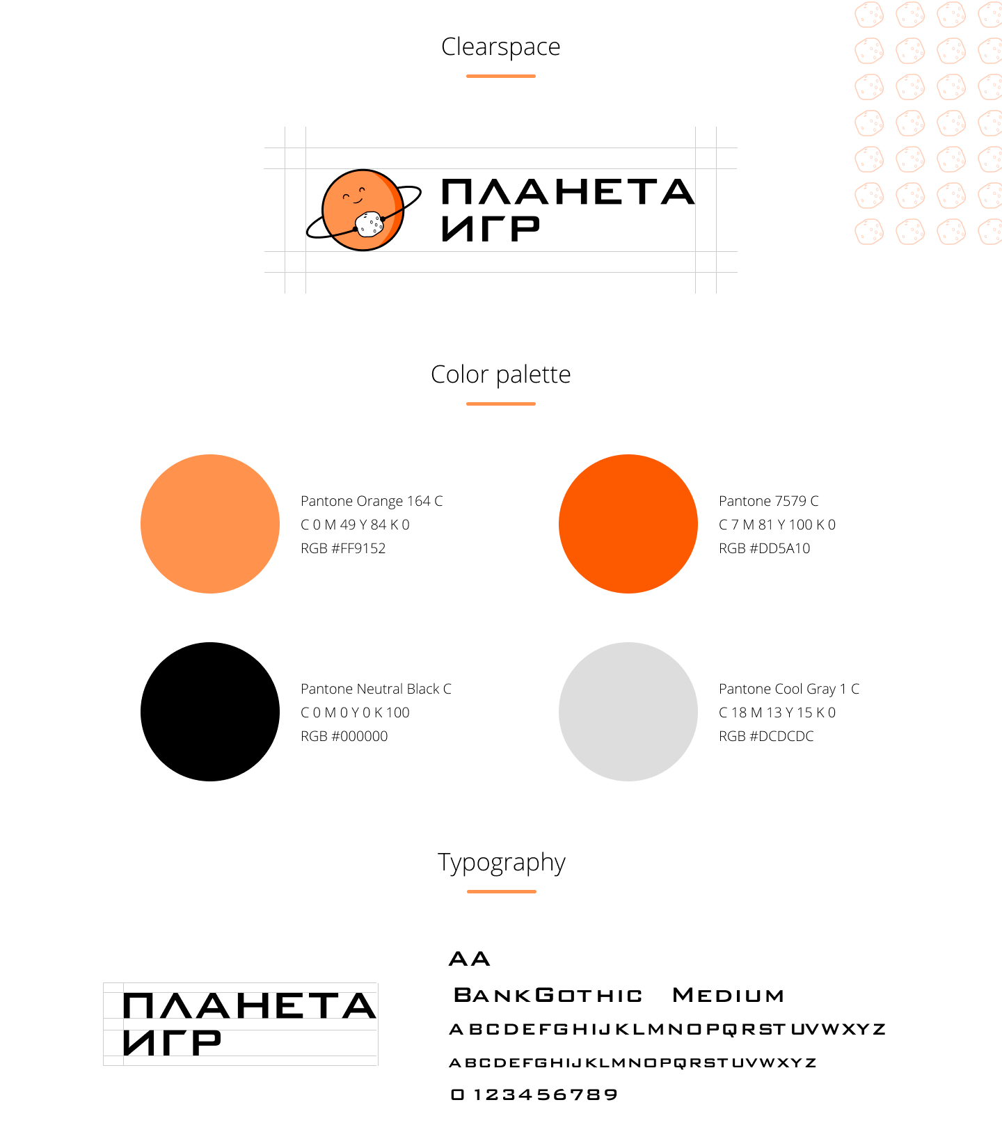
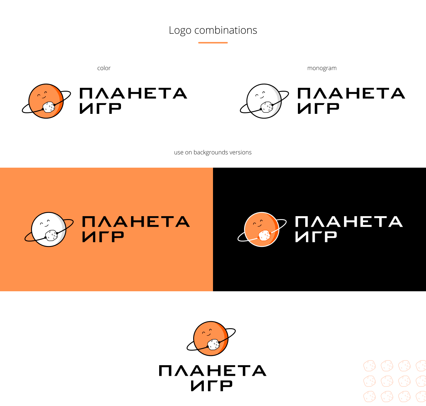
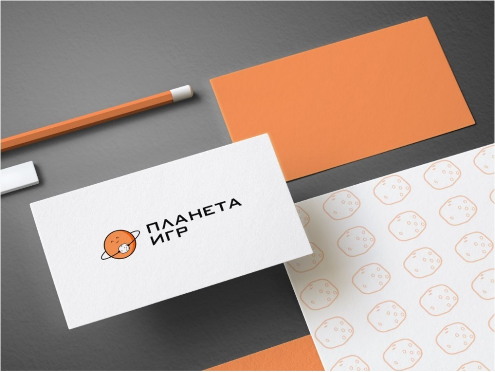
Our designers adopted the concept of minimalism, with which you can easily display the names in the logo. The designers were guided by the general premise - the planet of games. After creating different variants in the end, the designers used the planet Saturn, which is known for its ring. In its smaller company - the ring acted as the hands that hold the dice - this element evokes a direct association with board games. Also the planet itself added emotion - a cute and happy face, adds positivity and a friendly atmosphere to the logo. In this concept, we used three main colors - orange, black and white. This combination concentrates attention and intrigues with its concept in color.
What they did:
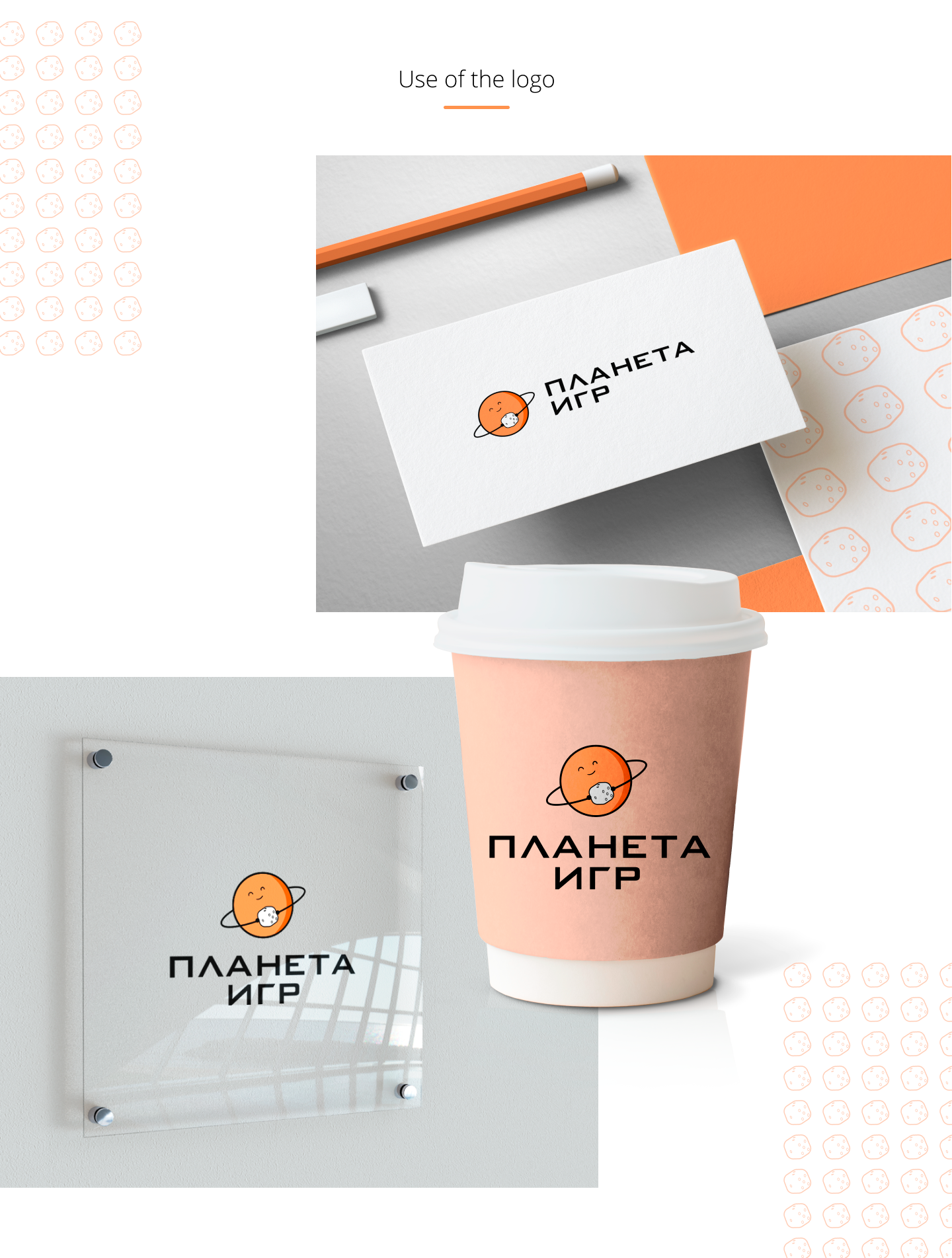
Developed a stylish and eye-catching logo design for the board game club that contained all of the client's wishes. We also presented mock-ups of the logo's use on the corporate identity - you can appreciate how spectacular it looks on the printed polygraphy
